Brand identity design is the process of turning a brand's strategy, values and personality into a consistent visual and verbal system: logo, colours, typography, imagery and tone of voice. Done well, it makes a business recognisable at a glance and easier to trust. This guide explains what it includes, how the process works and what to look for when you hire help.
Brand identity design is the work of creating how a brand looks, sounds and behaves, so people can recognise it and remember what it stands for. It sits between brand strategy (who you are and why you exist) and brand application (where people actually meet you).
A brand identity is the set of assets that make this visible. That usually means a logo, a colour palette, typography, imagery, graphic devices, and a tone of voice. Together they form a visual identity that works the same way on a website, a shopfront, a social post and a pitch deck.
It is worth separating two ideas that often get mixed up. Your brand image is what people think of you. Your brand identity is what you put out into the world to shape that thought. Good identity design closes the gap between the two.
The business case is simple. A clear, consistent identity builds recognition, supports pricing, and makes every piece of marketing easier to produce. A vague one makes you look like everyone else in your category.
A logo is one part of a brand identity, and a brand identity is one part of branding. People use the three terms as if they mean the same thing, which is why so many projects stall at the logo stage.
If you only commission a logo, you get a mark with nothing to sit next to. If you commission a brand identity, you get a toolkit your team can use for years.
A brand identity system is a set of connected brand elements designed to work together. These are the pieces most projects include.
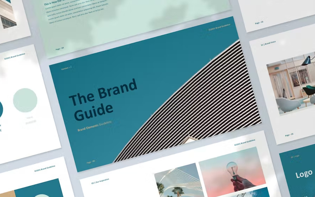
The guidelines are the part most businesses underestimate. A brand system without rules drifts within months. One with clear rules, examples, and templates stays sharp, even when different people produce the work. This is where brand guidelines and content earn their keep.
How to create a brand identity depends on the size of the business, but the sequence is almost always the same. Skipping the early steps is the most common reason identities look good on day one and fall apart by month six.
A useful test at every stage: could someone who has never met you pick this brand out from three competitors? If not, keep going.
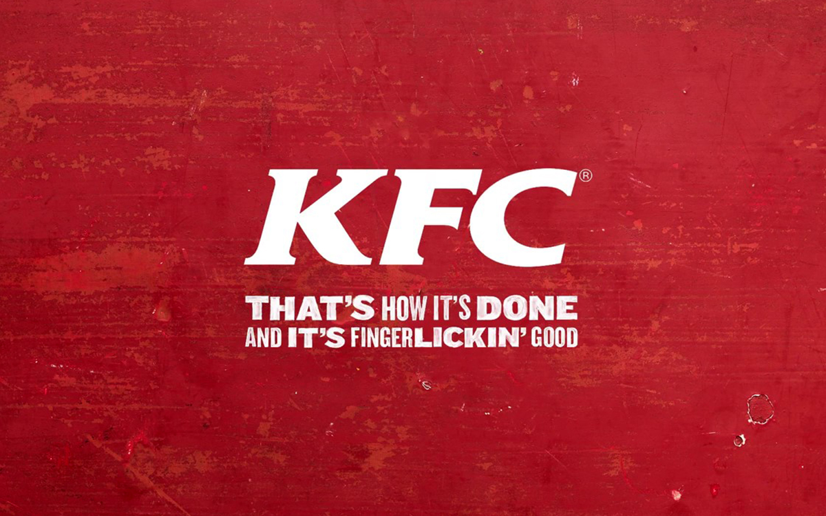
The best branding examples share a few habits, whatever the sector. Here are four well-known ones and the lesson each offers.
The common thread is not a clever logo. It is a clear idea, applied consistently, in a way the audience can feel. For more on how this plays out for real clients, browse our brand identity work, including projects for BASI Pilates and Clearsight Investments.
Brand application is where an identity proves itself. A system that looks great on a presentation board but breaks on a phone screen has not done its job.
Tech and SaaS brands face a particular challenge here. Products change quickly, so the identity needs to be modular, with rules that scale across interface, marketing and support.
Choosing a brand identity design agency or a freelance brand identity designer comes down to fit, process and proof. Use these questions to compare brand identity design services.
Curious Brand is a London branding agency with over 14 years of experience in brand development and visual identity, from strategy through to website, motion and content. If you are weighing up options, take a look at our services or get in touch to talk through your brand.
Brand identity design is the creation of a brand's visual and verbal system, including its logo, colours, typography, imagery and tone of voice, so the brand is consistent and recognisable everywhere it appears.
Visual identity covers what a brand looks like. Brand identity is wider: it includes the visual identity plus tone of voice, personality and the values behind them.
A logo is a single mark. A brand identity is the full system around it, including colour, type, imagery, graphic devices, voice and guidelines.
Most packages include a logo suite, colour palette, typography, imagery direction, graphic elements, tone of voice and brand guidelines. Many also add templates and mockups for key touchpoints.
A typical project runs from a few weeks to a few months, depending on scope. Research and strategy take the first part, and design and guidelines take the rest.
Define your purpose, audience and positioning first. Then design the logo, colours, typography and voice, test them on real touchpoints, and document everything in brand guidelines.
Costs vary widely with scope, from a lean freelance project to a full agency programme. The most reliable way to compare is to ask each studio for a clear scope and deliverables list, then judge value against what is included.
Consistency makes a brand easier to recognise and remember, and it signals reliability. Repeated exposure to the same look and voice builds familiarity, which supports trust.