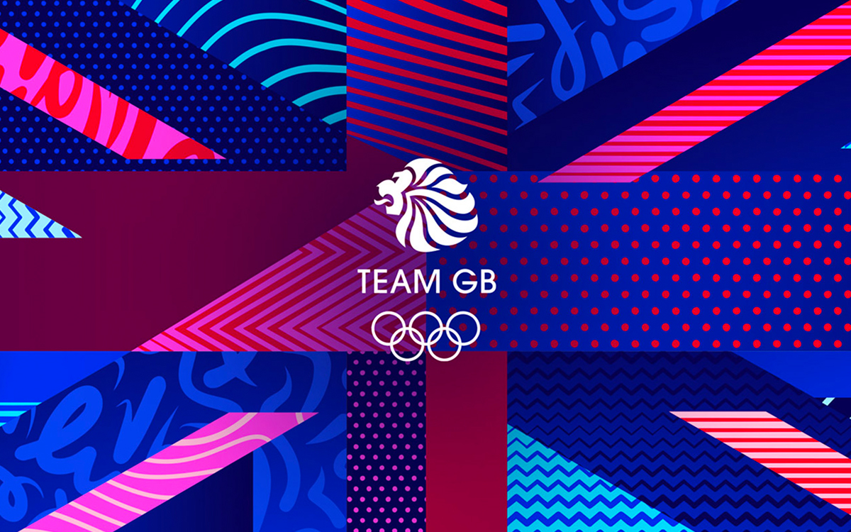
Embracing this spirit of duality - the "Everyday" versus the "Extraordinary" - Team GB, the symbolic emblem of the United Kingdom, Great Britain, and Northern Ireland's Olympic spirit since 1999, adorns a resplendent new identity.
This transformative manifestation, the brainchild of Bath-based agency Thisaway, pays homage to the mortal and immortal elements of Olympic athleticism, echoing the extraordinary journey of elite athletes in a language that reverberates with the audience.
Dynamic Patterns: The Aesthetic Framework
At the nucleus of Team GB's revitalized identity lie the dynamic patterns, akin to the vibrant mosaic of Greek mythologies. These patterns resonate with virtues like "discipline," "stamina," "speed," and "instinct," encapsulating their corresponding attributes in an abstract yet profound medium. Much like the rich tapestry of Greek tales, the textures, compositions, weights, and aesthetics of these patterns intentionally clash, resulting in an artful chaos that defines the brand's unique identity.
These patterns find their place in a wide array of contexts—sometimes morphing into abstract compositions, at other times coalescing into recognizable illustrations. Regardless of their application, these patterns create a distinctive and identifiable style for Team GB, promising infinite possibilities while ensuring a cohesive brand identity.
Typeface: The Linguistic Chisel
Etched with the precision of a master sculptor, Team GB, in collaboration with Lewis McGuffie, introduces a unique custom type family. This typeface veers away from the stereotypical bold aesthetic of the sports sphere, carving instead an elegant charm. Taking cues from iconic typefaces like Bureau Grotesque, Gill Sans, and Gotham, it crafts a distinct design aesthetic that dances between the "Everyday" and the "Extraordinary."
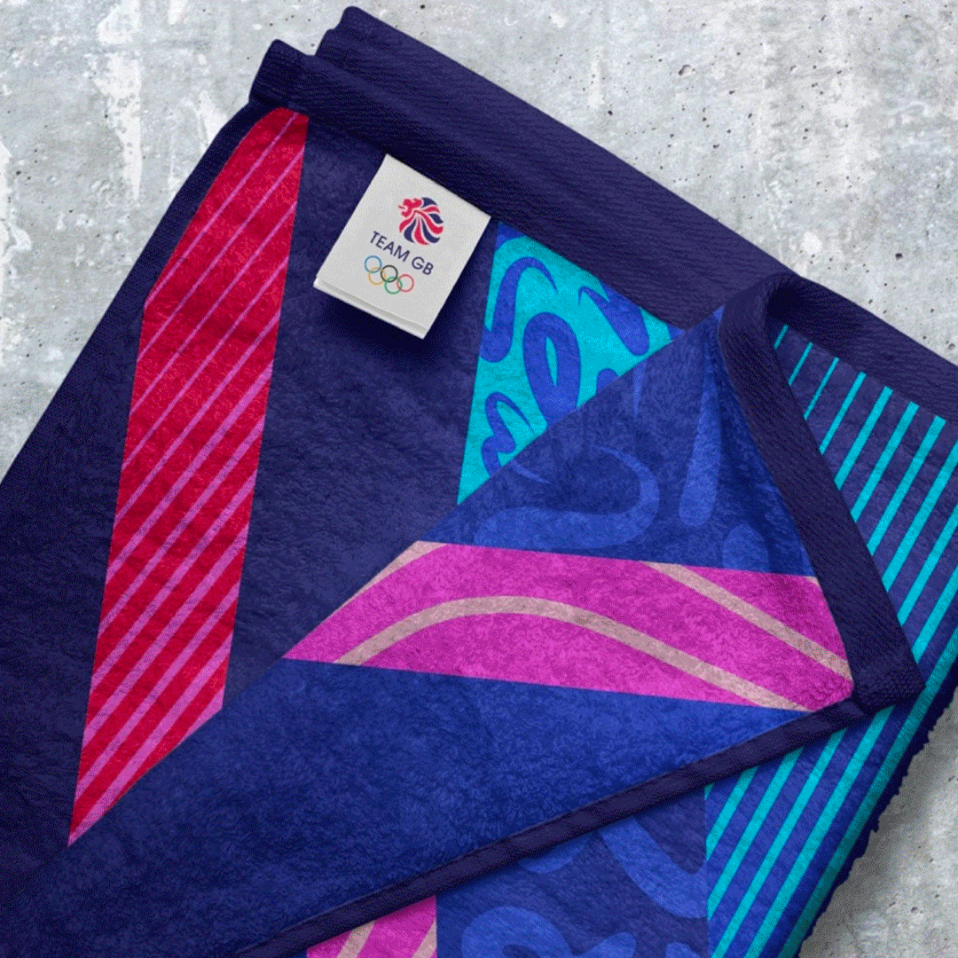
Color Palette: The Visual Amphora
The newly conjured color palette expands beyond the red, white, and blue of the Union Jack, by weaving in shades of pinks, purples, and blues. This spectrum of colors, while maintaining a whisper of patriotic sentiment, offers a versatile and attractive palette, infusing the brand with depth and complexity, reminiscent of a beautifully preserved Greek amphora.
The Torchbearer of Athleticism
In the grand finale, Team GB's new identity triumphs as a testament to the unwavering commitment and discipline that mold an elite athlete. It transcends the moments of intense competition, acknowledging the persistent repetition and quotidian rigor that mark an Olympic athlete's journey. By accentuating the stark contrast between the "Everyday" and the "Extraordinary," Team GB's brand identity kindles the athletes' steadfast dedication, fostering a sense of unity and shared spirit.
In essence, this new identity, with its distinctive typeface, enriched color palette, and dynamic patterns, powerfully encapsulates the ethos of Team GB. As we eagerly await the spectacle of the Paris 2024 Olympics, Team GB stands ready, like a well-trained Olympian, to make an indelible mark with its compelling new identity.
#TeamGB #BrandIdentity #OlympicSport #Inspiration #Unity
.svg)

.svg)