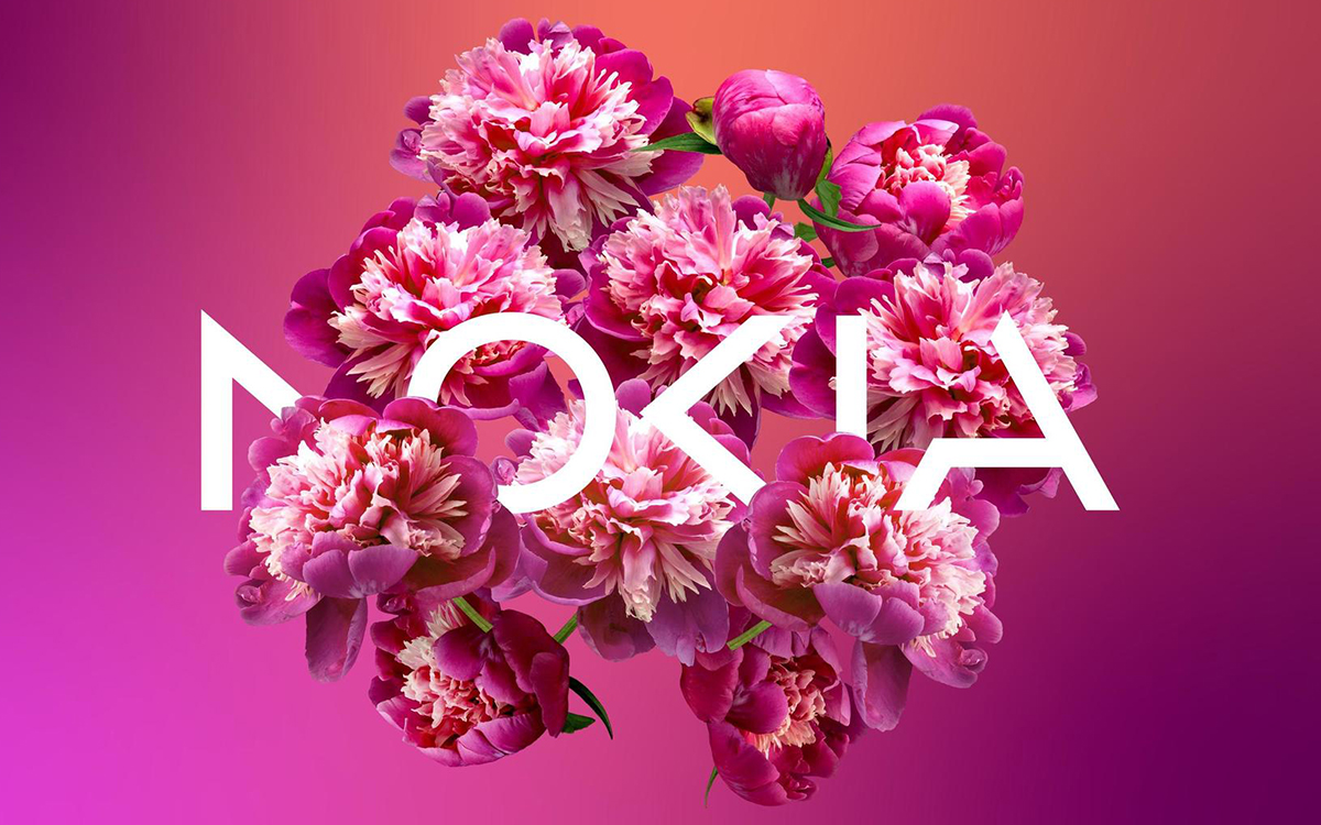
But fear not, the brand is not that and it just has unveiled a "radical" new logo that signals a shift from its mobile phone past to a future of innovation and technology.
According to Nokia, they want to be known as a B2B technology innovation leader that pioneers the future where networks meet the cloud, not just a successful mobile phone brand. So, they teamed up with design firm Lippincott to create a new logo that reflects their vision.
The new logo features lightweight lines and circles that spell out the word Nokia, but with a twist. Some of the letters have chunks missing, which some argue reduces legibility. Some people are comparing the new logo to the recent Kia rebranding, but Nokia is not one to follow in anyone's footsteps. They're trailblazers, forging their own path toward a future of networks and industrial digitalization.
And if you're feeling nostalgic for the old Nokia logo, don't worry. HMD Global, which owns Nokia's mobile phone division, still has the rights to use the old logo on their phones. So, while Nokia ventures into the future of technology, HMD Global can keep the old logo alive for the nostalgic among us.
.svg)

.svg)


.jpeg)